Home » Uncategorised »
Alternative Tube Map Shows Average Rent at Each Station
This article is an external press release originally published on the Landlord News website, which has now been migrated to the Just Landlords blog.

A new alternative Tube map shows how much it costs to rent near each London Underground station in the capital.
The map, compiled by Thrillist.com, reveals the sky-high prices tenants must pay for a one-bedroom home within a kilometre of each Tube station.
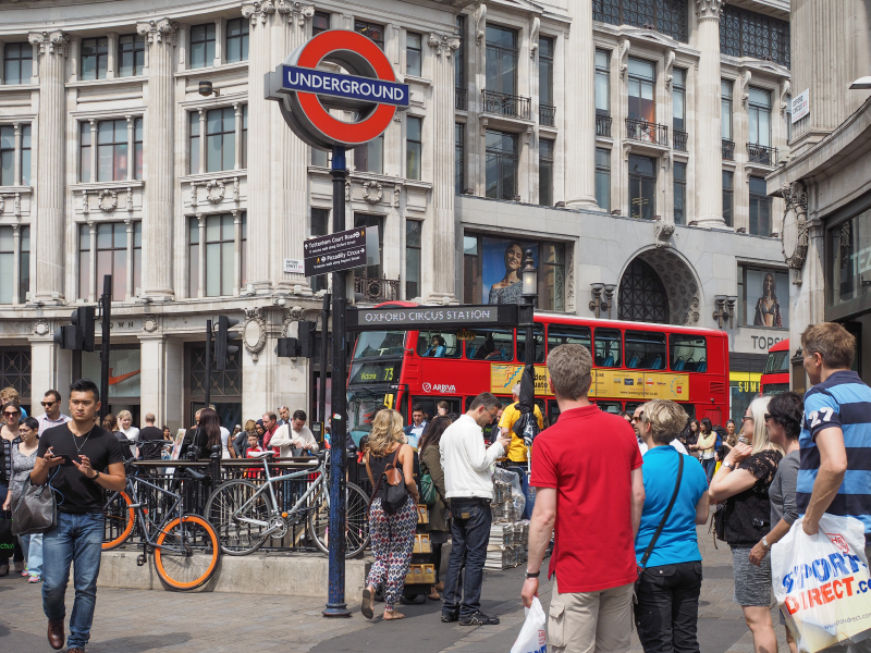
The illustration uses data from property website, Find Properly, and highlights the highs and lows of the central London rental sector, including prices in thriving tourist areas, such as Oxford Circus and Leicester Square.
Another super expensive area on the map is Bank, which is at the heart of the City of London financial district. One-beds here can cost £2,128 per month.
Renters in the upmarket West London areas of Hyde Park Corner and South Kensington are also paying similar prices.
However, the map does indicate a divide in prices, with the average rent near the East London station of Dagenham Heathway costing £796 a month, while prices close to the suburban West London station of Hatton Cross are just £324 per month.
Data from June reveals that London rent is almost double the national average and rose by 10.7% over the year.
London has been ranked the third most expensive place to live, after the Cayman Islands and Switzerland.


